Project 6: Postcard

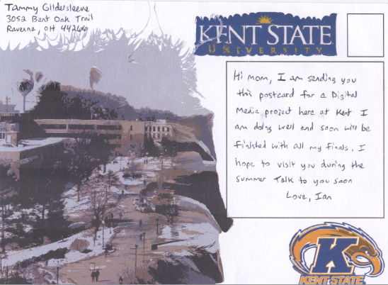
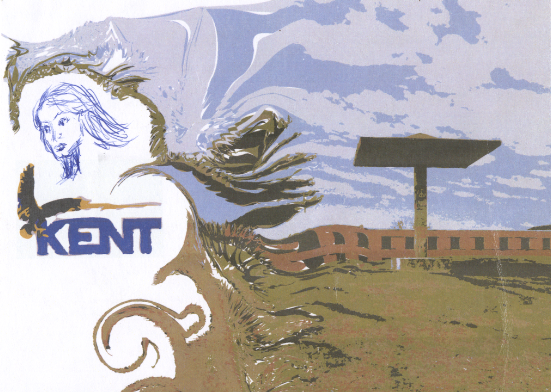
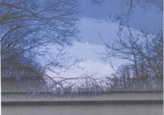
For this project we used Illustrator to create custom postcards. The postcards I created contain imagery located in and around the Kent State campus. The first one shows a picture of the campus taken from the library, and the back is a picture of The Pagoda sculpture located next to Taylor Hall. I used the whirl effect tool to generate the psychedelic swirls you can see in this postcard. As for the second one, they are photos of a baseball field and wooded area located across the river downtown. This one is my favorite postcard because the back depicts a beautiful picture I took that I am quite fond of. For this particular postcard, I used the crystallize tool to create a visually appealing effect.

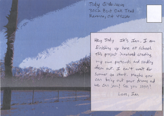
After creating the postcards, we were then instructed to mail them out. I mailed them to my mom and step-dad. My mom altered the first postcard by making a doodle on the back, a little sketch of a woman that she enjoys drawing every now and again.

In my opinion, I feel that these are successful pieces. It was a simple project that incorporated an outside response. However, I definitely should have mailed the postcards out sooner than I did, instead of doing an over-night delivery which cost me seventeen dollars. Also, mailing them this way caused the post-office to mail the postcard in an envelope which in turn did not require a stamp on the actual card. I would have liked to see a stamp with the post-office stamp over top. Other than this little offset, I believe I completed this project in a rather unorthodox manner but at the end of the day, the project is still complete and has transferred among a few hands. All in all, my expectations remained stable throughout the entire project. Although, it was funny to see that my mom drew her figure drawing of a girl. That brought back a lot of memories when I was younger when we used to go to Texas Roadhouse and play hangman on the table while waiting for food. She used to draw that facial portrait every time, on a much larger scale. So, this project was successful in generating an emotional response by myself.

Postcard1.1 Postcard1.2

Postcard2.1 Postcard2.2

Project 10: Human Movement

I began this project taking short clips of myself doing basic flip tricks on my skateboard within the art building. I wanted to show a slight progression of difficulty of specific skate tricks, but as I put more and more work into the project I depict a variety of tricks throughout the entire video. The intro shows layered effects displaying a ghostly quality. This effect was easily done with the help of my professor because I shot the intro clips from the same spot and same angle with my iPad.  The straightforward sense of the intro transitions to a subtle narrative of myself skating throughout various floors of the art building and the process of doing as such. Some problems I encountered within this program are limited, but I did run into some annoying occurrences such as transitions not working properly and clips becoming misaligned and chopping into one another when I attempted to move them around. In regards to the program, it is very simple to use and the editing of raw footage can be done very quickly to create an engaging video.

After reviewing my video multiple times, the only thing I really thought I could work on was some of the timing of the tricks with the music. For the most part, everything lined up almost perfectly with the music in a coincidental fashion. I enjoy it when things in artwork mesh together without much work. Another thing I could have pushed was the elevator sequence. I agree that this sequence doesn’t particularly flow with the rest of the video and it almost seems like filler. To combat this I could have spaced the two elevator clips apart, one in the beginning and one in the end. Also, the sequences are quite generic, very cinematic in that elevator scenes can be a very common occurrence in videography and movies. One last thing to nit pick was my decision of background for the different skate scenes. I don’t have a problem with the intro background, for it is empty and doesn’t cause any distraction with the vacancy. The scene I do have a slight problem with is the segment right after using the elevator a second time. This particular scene can be a bit distracting with the solid black trash can very close to me. The learning process of this creation of video has allowed me to definitely take background into consideration for future shooting.

In conclusion, I had a lot of fun with this project. I have been skateboarding for about 13 years and I’ve always shot singular tricks from time to time. I have never really created a legitimate montage of my skating, and I believe I created a relatively strong one as my first. Now that I have created a simple flat ground montage, this summer I plan to get some heavy duty skating in (stair-jumping, handrails, etc.) and create a real skate part. Furthermore, collaboration with my friends shall occur and I hope to progress my skating abilities.

Project 11: The Hybrid

This project is incorporating digital art along with physical art, hence The Hybrid. The first thing that came to mind when thinking about this project was my love for painting, so I will definitely be doing some oil paintings to cover the physical art aspect. I currently have some wood panels primed and ready to go from my personal studies, so I will be using those in this project. Along with the paintings, I will be utilizing Illustrator to best emulate a painterly handling in digital form. I finished one oil gradation already, so I will need to finish the other two panels before hopping into Illustrator. I would rather work in this order as to conjure a better variety of ideas rather than getting confused with Illustrator for I wouldn’t have a concrete idea without painting first. The biggest challenge won’t be the paintings themselves, rather creating cohesive pieces which mesh together compositionally and are balanced. Again, all I have done now is a smooth gradation on one panel. I plan to increase the subject matter to a topic I have not yet defined. I might just end up sticking with gradations, taking into consideration how much I need to paint. Also, the addition of some sort of subject matter on top of these gradations may pose a confusing composition.

Project 10: Human Movement

For our final project for Digital Media we are required to create a 90 second video which depicts human movement. Since I’m very passionate about skateboarding, I have chosen to create a simple human movement video showcasing some of my favorite flat ground tricks. I shot many videos of different tricks, and it wasn’t until I was done that I noticed I shot every video from the same spot and same angle with my iPad. My professor saw this and helped me use it to my advantage. He began making some copies of some clips and moved them to the beginning of the video, also decreasing the opacity on them. What he left me with were clips layered on top of clips, creating a mask effect which I thought was completely awesome and am very content that he showed me this technique. This technique could not be done if I shot each clip at different angles. The effect creates a much more engaging video rather than a straightforward clip, and I feel like it really builds on the topic of human movement in a unique way. Another detail from the video which is currently missing is slow motion. Since this video shows fast-paced skating, slow motion is critical in enhancing the video to a more delicate degree. Other than some small tweaks and utilizing different effects, I feel like this project is moving along smoothly. 

Project 9: In-Class Video

For this project the class continued to delve into Adobe Premiere Elements, but this time on a grander, more-polished scale. Instead of the previous project in which we created a 25-second video with 5 different clips of the Rockwell Hall, we were required to create a one-minute narrative detailing what made us particularly angry. After capturing the videos, we then partnered up with one other person in the class and exchanged videos, leaving each other to create a narrative not using our own videos. This “exquisite corpse” approach added much more variety to the overall project, I feel.

I was very impressed with how my video turned out. I spent many hours fine tuning the final video. I scoured the internet in search of many different examples of sound effects of which I tried to remain consistent with throughout the video. Also something I’m happy about is how much I learned about the program from playing around with it myself or talking with my peers. One example of what I learned was lining up sound effects by comparing decibel ranges. Another aspect I really improved upon was the utilization of a variety of clip transition effects. Again, it took a lot of time to get these effects to match up perfectly with the video and sound. One thing I could have added throughout the video would be different forms of human speech, alongside Gabe’s cameo speech which occurs during the credits. I felt I really had a handle on the transition effects and usage of sound, but dotting the video with certain instances of speech could have made for a stronger project. In conclusion, I really feel like this video was a success and enjoyed the creation process of this project.

Project 8: 5×5

This project introduced our class to Adobe Premiere Elements. We captured footage from the museum at Rockwell Hall and the aim of the project was to create a sort of narrative. This was my firsthand experience with the program, and I felt I had a handle on how to accomplish the project. I basically chose the videos I was particularly interested in, pieced them together, and added stock sound effects I found online. I didn’t want my videos to be too in-depth in regards to the required narrative, so I created a simple straightforward video with literal depictions. As being my first project with Premiere, I was surprised at how simple and user-friendly the program was. Things were very simple to catch on as my project progressed. However, I wis I utilized the transition tools of which I am now aware of. My clips cut right into the next clip, and I feel Like I definitely could have utilized the transition tools to yield a much smoother video.

In-Class Video Proposal

For this new project, we are recording a minimum of 12 10-second videos depicting what makes us individually angry. I plan to walk around campus and search for things that make me angry such as long lines at the hub, KSU parking enforcement, and maybe even go as far as to depict the outrageous cost of college. I do not think I will utilize actors in my film, as a solo journey of finding things that make me angry would be sufficient enough. Part of being a filmed and/or photographer is waiting for the right moment to capture what is occurring. And many times these moments find the filmer when he/she is least expecting it.

I will use this concept to capture footage for this project. Part of the battle is searching for what I want to achieve in this project. I want to find unusual things that would make me angry, and try to stay away from being to generic and unoriginal. The smallest, mundane things can make people angry. I sense that it will be simple to capture these videos in the imperfect world we live in.

I plan to push myself further than what was accomplished in my 5×5 project, although that was a simple introduction to the programming. I want to explore the tools more than I have been and add a smoother transition from clip to clip without being too noticeable. Another thing I am excited to delve into is the incorporation of text in this new project.

Moving Images 5×5 Project Proposal

For this project our class first took a walk to the fashion building at KSU, Rockwell Hall. We walked through the historical timeline of a museum filled with a variation of different aspects of times from long ago. These aspects included a plethora of dresses, many examples of glass and chinaware, and a collection of very early bifocals. What was required for this field trip was 30 individual videos each lasting 10 seconds long. The aim of the project is to illustrate a narrative of these aspects to create a story, hence narrative. From walking through the museum and seeing a historical timeline of early inventions of travel, I began to put together what I wanted to achieve. I captured many posters and illustrations conveying early means of human travel. Since everything followed a timeline throughout the museum, I want to create a narrative of the protrusion of means of human travel into the modern age utilizing the Adobe Premier Elements program to combine my videos together. I haven’t given the addition of music much thought, however I think it would be fun to come up with a new riff on guitar to record and place it over the video. I am completely unfamiliar with this practice of creating movies, but I feel that my idea for the project should result in a strong narrative.

How Many Colors I See

The recent viral outbreak of the famous BLUE AND BLACK dress prompted quite a following. My Digital Media professor wanted the class to read an interesting LinkedIn article based on neurological findings dealing with the number and distribution of color receptors (cones) in our eyes. We took a look at the following image and tested how many colors we could see.

bigger-colors

I can see 39 distinguishable colors. According to the article, I am a tetrachromat, similar to bees who have 4 types of cones. 25% of the population is tetrachromat.

People who see less than 20 colors are dichromats, like dogs. Dichromats have 2 types of cones. Again, 25% of the population are dichromatic.

Seeing between 20 and 32 colors yields a trichromat, having 3 types of cones. 50% of the population is trichromat.

Propaganda Project

propaganda-6soviet-space-program-propaganda-poster-24Image: A view of the abandoned city of Prypiat, near the Chernobyl nuclear power plant   A radioactive sign hangs on barbed wire outside a café in Pripyat.

For this project, we are creating our very own propaganda poster. I envision my project to incorporate elements from 1960s Russian propaganda and crossing them over with imagery from the Chernobyl nuclear power plant disaster from 1986. Although Chernobyl is technically located in the Ukraine, at the time of the disaster this area was under direct jurisdiction from the Soviet Union. Therefore, I do not see any problems with crossing both of these elements together to form one composition.

I really enjoy 1960s Russian propaganda, mainly for the space race imagery which I’m fond of. I also like the look of Russian characters in general. Combining these elements with a bright Russian-red color yields a visually appealing poster. I really hope to emulate a Russian propaganda poster that looks like Cold War propaganda with a 1960s feel, but utilizing Chernobyl as the subject matter. Another idea that recently ruminated in my mind while writing this proposal was a theme park theme. In the first image of Chernobyl above, there is a desolate ferris wheel I could see myself adding other rusted, broken down roller coasters and rides. The whole composition would have an empty feel to it, but the text and other elements will reflect happiness and joy, inviting people to visit the Chernobyl theme park. I feel like this idea would also be comedic rather than the serious tone that most propaganda harnesses.